SaaSFrame
Bento Grid Design: A Practical Guide With Real SaaS Examples

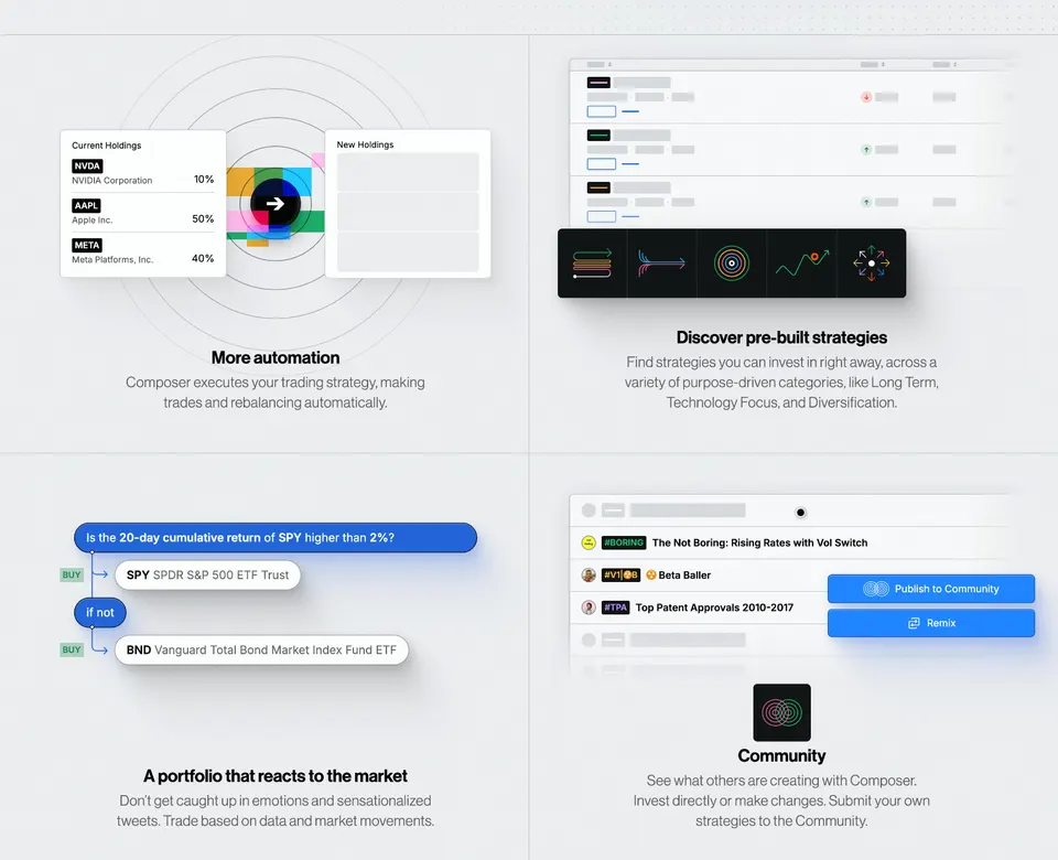
A bento grid works when a product has four to eight capabilities of uneven importance. Give the most important one the largest tile, put a real UI fragment and a short caption in every tile, keep one visual language across tiles, and collapse the grid to a single column on mobile in order of importance.
- Use a bento grid for four to eight related capabilities, not for a single message or a long feature list.
- Tile size signals importance: the largest tile goes to the capability that sells the product.
- Each tile needs a real UI fragment and a caption of one or two lines.
- One visual language across tiles (background, radius, type) keeps the grid calm.
- On mobile, stack tiles in order of importance rather than shrinking the grid.
Bento grids took the pattern of Apple's keynote summary slides to SaaS websites: one section, several tiles of different sizes, each showing one capability. Done well they are the fastest way to show breadth; done badly they turn into a wall of decorative boxes.
As of November 2026, SaaSFrame holds 55 bento grid sections from 46 different SaaS. The examples below come from that set.
When should you use a bento grid?
When you have four to eight capabilities that belong together and each deserves a visual. A grid shows breadth at a glance; it is the wrong tool for one key message (use a hero) or for twenty features (use a list or table).
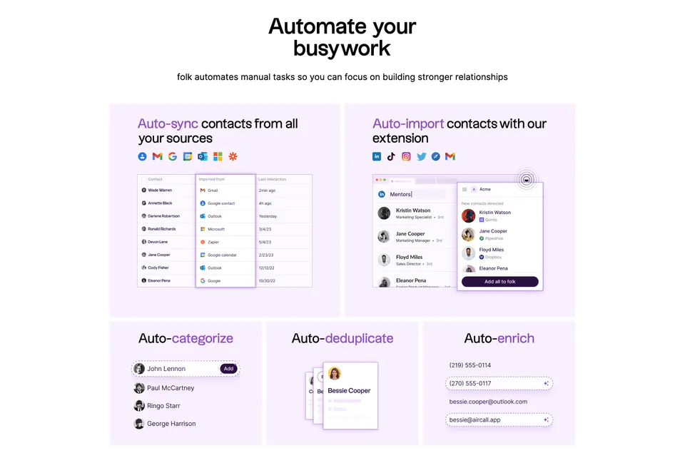
How do you size the tiles?
By importance. The largest tile should carry the capability that sells the product, and smaller tiles the supporting ones. Equal tiles say "these are equally important", which is rarely true.


What goes inside each tile?
A real fragment of the interface and a caption of one or two lines. Fragments prove the capability exists; abstract illustrations ask the visitor to trust you.
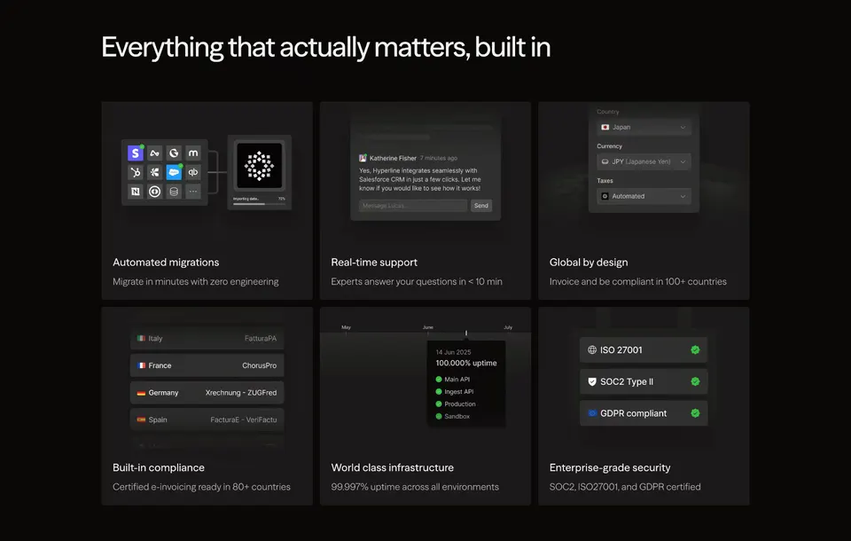
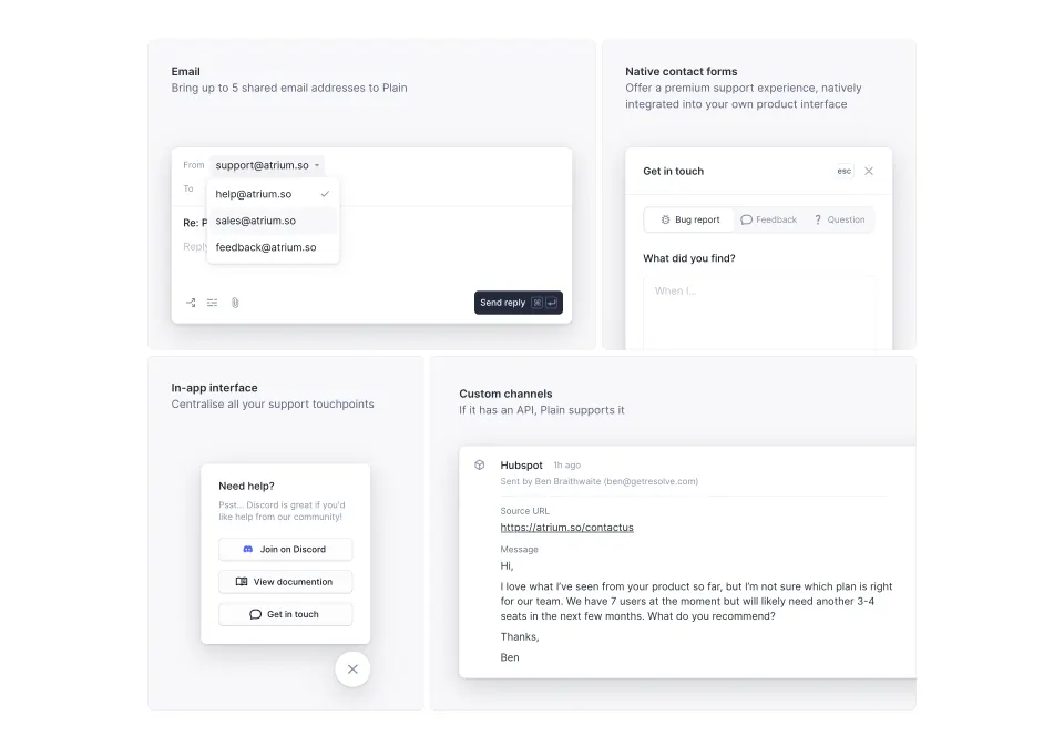
Rule of thumb If a tile still makes sense with its caption hidden, the visual is doing its job.
How do you keep a bento grid calm?
Use one visual language across all tiles: the same background, corner radius, padding and type scale. Variety should come from the content of the tiles, not their styling.
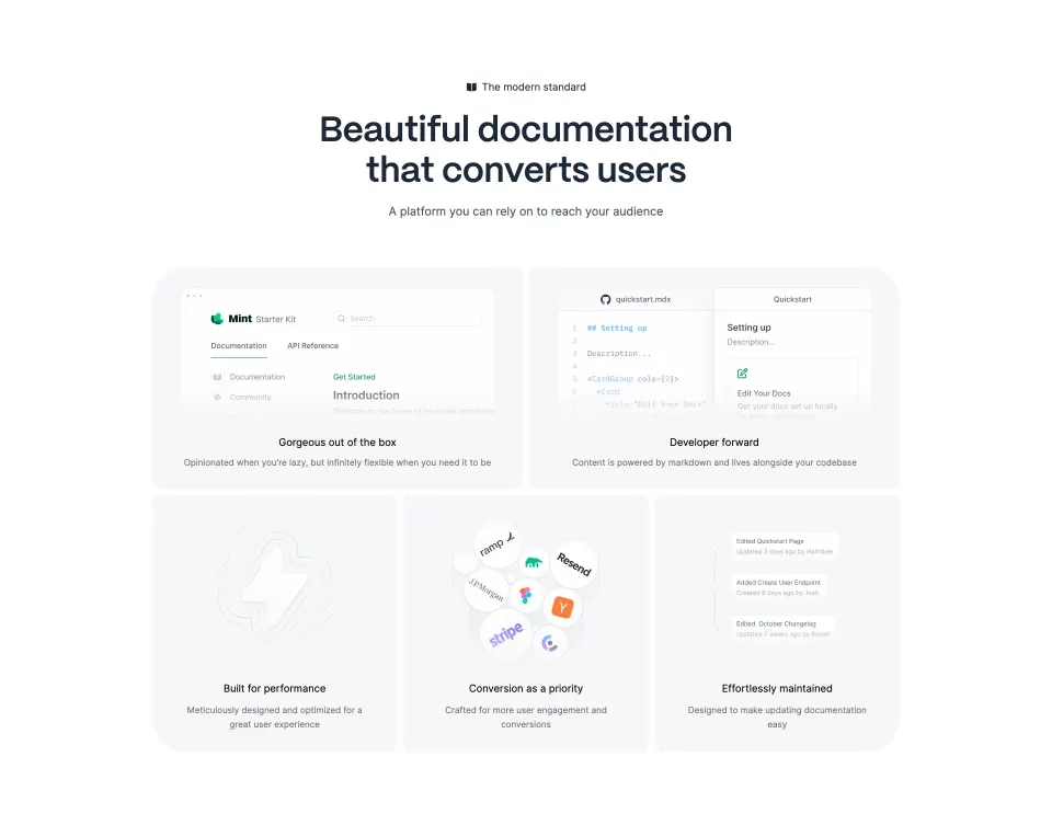

How should a bento grid adapt to mobile?
Stack it in order of importance. Write the tiles in the markup in the order you want them read, collapse to one column, and avoid tiles whose meaning depends on their position next to another one.
What are the common bento grid mistakes?
- Decorative tiles with icons or gradients instead of product.
- Too many tiles, so each fragment becomes unreadable.
- Captions longer than two lines.
- Tiles that animate all at once.
- Using a grid where a single strong feature block would say more.
Where can you see more bento grids?
Browse the bento grid pattern, feature sections and the features page category. For the rest of the page, read SaaS landing page trends for 2026.
Frequently asked questions
What is a bento grid in web design?
A layout of rectangular tiles of different sizes, arranged in a grid like the compartments of a bento box. On SaaS sites it usually presents several product capabilities in one section.
When should you use a bento grid?
When you have four to eight capabilities that belong together and deserve a visual each. For one key message, a hero or a single feature block is clearer; for twenty features, use a list or a table.
How many tiles should a bento grid have?
Most SaaS bento sections use four to seven tiles. Beyond that, tiles get too small to hold a readable interface fragment.
How do bento grids work on mobile?
They usually collapse to one column. Order the tiles by importance in the markup so the stacked version reads well, and avoid tiles whose meaning depends on their neighbour.
How common are bento grids on SaaS websites?
As of November 2026, the SaaSFrame library has 55 bento grid sections from 46 different SaaS, which makes it one of the standard feature-section layouts.
 Bento Grid52 examples
 Features131 examples