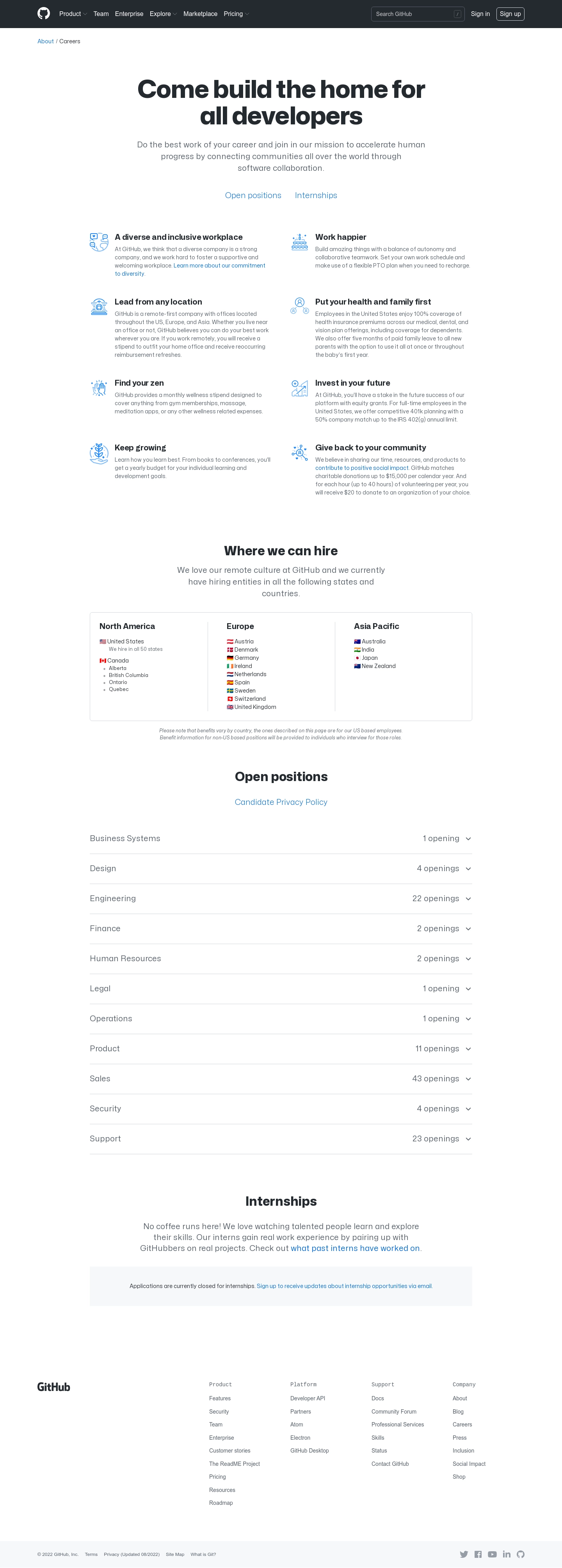
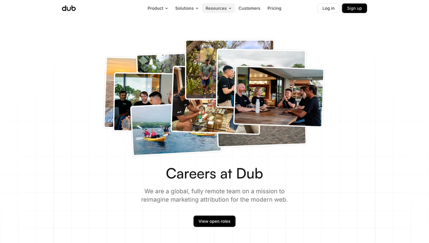
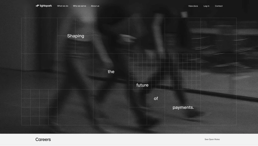
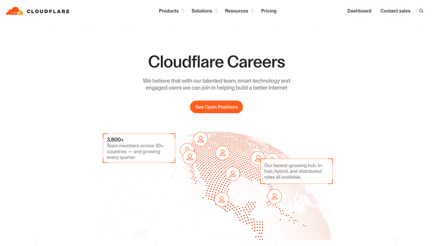
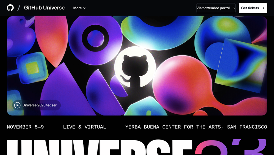
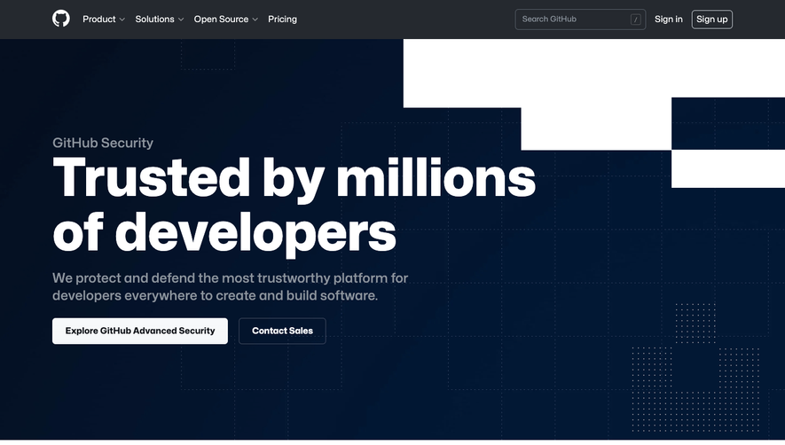
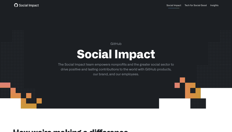
GitHub Careers’ page exemplifies a modern, minimalist ethos with a distinctly professional undertone. Generous white space, crisp edges, and restrained splashes of accent color contribute to a clean aesthetic. The visual language carefully balances a welcoming vibe with gravitas, signaling GitHub’s industry leadership while remaining approachable and inviting.
Layout and Structure
The page adopts a classic, linear SaaS landing structure. A bold hero section welcomes visitors with a succinct statement about GitHub’s mission, reinforced by a prominent global illustration. Below, content is thoughtfully chunked into scannable sections: compelling why-work-here copy, core values, employee benefits, and region-specific opportunities. Structured, modular grids separate these segments, guiding the eye along a clear narrative without adding visual clutter. The persistent header simplifies return navigation, while the sticky job search CTA ensures conversion.
Visual Elements
Expressionistic SVG illustrations—featuring people, code motifs, and global communities—inject energy and human warmth. Icons are crisp and purposeful, aiding content comprehension and breaking up text. Photography is limited but strategic, lending authenticity via real-world glimpses into GitHub’s culture. Micro-animations on hover enrich interaction without overwhelming.
Color Palette and Typography
A palette of deep navy, white, and gentle accent blues grounds the page, with subtle pops of green for CTAs and highlights. GitHub’s iconic monospaced and geometric sans-serif typography builds visual hierarchy: bold headlines, clean body text, and secondary details in lighter weights knit together a cohesive reading experience.
User Experience Patterns
Navigation is instantly familiar, with sticky header links and easily accessible search. Calls to action—“View Open Positions”—are consistently visible and visually distinct. Information is delivered in concise, digestible blocks, often made interactive for exploration, catering to power users and casual browsers alike.
Unique or Notable Design Choices
GitHub’s commitment to diversity, remote work, and global reach shines through visual metaphors—world maps, multi-ethnic illustrations, and narrative copy. The absence of intrusive forms or aggressive pop-ups grants a dignified first impression, emphasizing user control. The design radiates trust, innovation, and inclusivity—qualities every SaaS brand should aspire to.
 SaaSFrame